Friday 20 April 2012

Taken

This is the final copy of our groups horror movie and has been uploaded to Youtube. To view on Youtube please follow the link below.
http://www.youtube.com/watch?v=G08KiRqOoGs&feature=player_embedded

Thursday 19 April 2012

Evaluation Activity #7

Looking back at your preliminary task (the continuity editing task), what do you feel you have learnt in the progression from it to full product?

Before begining this media studies course I knew very little about the various camera shots which we would be using or how to edit film footage using the computer software, Adobe premier pro. The preliminary task video (which I have previously posted) was a challenge as we had to include the following shots:
  • 180 Degree Rule: This shot technique sets a line which actors/actresses follow and the camera should not pass in order to prevent transations which are confusing and cause the audience to misread a scene.
  • Match on Action: This shot technique is where footage is cut within an action from one shot in order to smootly tansistion to the next.
  • Shot reverse shot: The shot reverse shot is used in order to show a conversation between two characters who are performing dialect and then switches to the other character when the turn of speech is changed.

Above are some screen shots from both preliminary task video and Taken film which shows these shots. Without copleting the preliminary task I would have also been unable to edit the 'Taken' film opening as the preliminary task taught me the basic of editing the film. Within the time of editing the prelim video I also gainined knowledge on other useful editing features which where camera blur, black and white keying, ghosting, audio editing (audio gain/sound effects) and dissolve transitions which I used in the editing of the film. By complete the Preliminary task I was able to experiment with the different features within Adobe Premier Pro and learnt how to use these new editing techniques which I used as editor of our film in order to make smooth transitions and greater effect for the audience.

Wednesday 18 April 2012

Evaluation Activity #6

What have you learnt about technologies from the process of constructing this product?
Canon MD101 (left) and Hama tripod (right)

The camera we used was a Canon MD101 which featured a 2.7 LED which enabled us to watch back the footage which we had captured for our film. As this camera is light it enabled use more mobility which was helpful for our POV shots that we used. A problem which we had with the camera we used was that it was not a HD camera which not only effected the picture but also the audio which was picked up as some of our footage had muffled audio which had to be edited or re-shot.

The other piece of equipment was a Hama tripod which was beneficial as it enabled us to shoot steady shots, especially panning shots which are in the cemetery and torture scene. The tripod also featured a spirit level which was of use as we was able to make sure that the camera was not at an unwanted angle or on a slant whilst shooting a steady shot. 

Editing film using Adobe Premiere Pro
In order to edit our footage for our final film I used a video editing software Adobe Premiere Pro which was beneficial as I was able to create our production company logo, add sound effects; this was effective an used a lot within the film such as when the teenager is struck by the baseball bat, add music; which was important within the opening and introduced the horror genre and conveys the doctor/surgeon's character. The software also enabled me to add in special effects which helped to have more of an effect which can be seen in the POV shot of the teenager with the blur effect. This also enabled me to make fade transitions, audio gain, and insert credits for the film opening. Below are the internet and software which I used in order to make my groups horror film opening.

1) Youtube: I used Youtube in order to upload out groups video so that people could view 'Taken', I also used Youtube in order to complete evaluation activities numbers 3 and 5 as I was able to upload the video commentary and annotate the video for evaluation activity 5.

2) Windows movie maker was a piece of software which I used in order to export the movie and change the format from an adobe premiere pro project into an avi. format video in order to upload to Youtube.

3) Blogger is an internet service which I have used to upload and publicise my AS Media Studies coursework for everyone to see. It also enabled me to make edits to posts and change the layout which I wanted my work to be displayed for viewers.

4) Adobe Premiere Pro is another piece of software which I used in order to create our groups horror film opening, this was useful to use as it enabled me to edit the original footage as well as adding effects and editing techniques which would make the opening more appealing to the viewers.

Tuesday 17 April 2012

Evaluation Activity #5

How did you attract/address your audience?

To view the annotations on the video please view on Youtube: http://www.youtube.com/watch?v=TuvVe1olAwc&feature=player_embedded


List of video annotations (In order of appearance) 
  • This is the the logo which we created for production company 'Unique Productions'. The music we edited to go with the logo is rememberal and grabs the viewers attention which helps to create identity for our production company.
  • Camera: Close up shot to show alcohol which is relevant to the character.
  • Editing: Dissolve from credit into opening scene.
  • Sound: Eerie music to introduce the horror genre of the film (non-diegetic).
  • Mise-en-scene: Alcohol which is relevent to the character.
  • The alcohol which is seen within the opening is important to the character and the plot of the which is the unique selling point of our film. The alcohol not only shows that the character is drowning his sorrows it also reflects the theme of isolation which is typical of the horror genre.
  • Editing: Black and white keying to change the mood of the scene.
  • Editing: Dissolve, into grave yard scene setting.
  • Camera Shot: Panning shot of the graveyard to show the setting.
  • Camera Shot: Long shot. this shows the characters isolation in the setting of the alley connoting that he is vounrable which is typical horror genre.
  • Editing: Dissolve into new setting alley way where the teenager is leaving the graveyard.
  • Editing: Cross cut when then is struck i order to change the scene and the character being knocked out.
  • Sound: Swinging bat and sticking (non-diegetic).
  • Sound: opening door and footsteps (asynchronous).
  • Camera Shot: Point of view.
  • Sound: Sound of record player, background song which is happy but makes the torture scene more eerie and reflects the doctor's character.
  • Editing: Camera blur for character's view.
  • Editing: Dissolve from black screen to change scene and character waking up.
  • Camera Shot: Point of view.
  • Camera Shot: 180 degree rule to show both characters on screen within a long shot.
  • The idea to use the music within a torture scene was inspired by the film 'Reservoir Dogs'. The use of the use of the music also made the scene more eerie which linked in with the horror genre.
  • Editing: Audio gain of the doctor slapping his victim across the face to emphasize the slap.
  • Editing: Dissolve to show change in time.
  • Sound: Censor to cover swearing (non-diegetic).
  • Mise-en-scene: Surgeon tools which reflect the doctors character.
  • Camera Shot: Panning, shows the desk which the doctor has walkked over to in a close up shot.
  • Camera Shot: Close up to show weapon.
  • Editing: Dissolve.
  • Mise en scene: Blood marks on the wall from the victim and Doctor holding which is typical horror prop.
  • Editing: Dissolve to change scene.
  • Mise en scene: Doctor putting on gloves and tools which the Doctor used to torture his victims which links with the horror theme.
  • Editing: Audio gain on the needle to empasize the sound of the of the liquid which the Doctor uses on the victim.
  • Sound: Needle squirting (non-diegetic).
  • Camera Shot: Extreme close up to show needle.
  • Sound: Scary sound (non-diegetic).
  • Editing: Movement of title 'Taken'.
  • Sound: Scream (non-diegetic).

Monday 16 April 2012

Evaluation Activity #4 Pt.2

Who would be the audience for your media product?

Target Audience – Questionnaire Summary.
In order to gain feedback on our opening we made questionnaires which I target at the chosen target audience (age: 18-24) of my groups horror production. I have inserted the questionnaire I used to gain information below;
1. Does it relate to a horror film?

2. Is there enough characters?

3. Is the music suitable for the opening?

4. Would you continue to watch this film?

5. Does the editing work? (Effects)

6. How would you end the opening sequence?

7. How would you improve it?

8. What works well?

Summary of Results
After handing out 10 questionnaire the rulsts showed that our opening credits scene was not suitable of the horror genre as the music (which answers questions 1 and 4) gave a sense of the comedy genre which was a concern and influenced me as editor to edit the title scene music. On the other hand the results informed us that the opening of the movie (torture scene) was suitable for the horror genre.
From analysing the results I found that the we used enough characters for our opening and the editing worked well as the effects were appropriate and well used, this is also what worked well within the opening andincluding the use of camara shots and music within the torture scene, although the song I chose for the torture scene is a happy tune I felt that it would be effecitve as it gave an eerie effect which is typical of the horror genre and may also resemble the doctor/sergeon’s character.  However the questionnaire also showed that we could improve our horror movie by changing the opening credit music, move the title to the end of the opening and cut out some of the build up to the attact as people felt that the build up was too long.

Psychographics

Interests: As teenagers enjoy to socialize I thought that they would like to visit the cinema to watch a film in numbers, I also thought that teenagers prefer films with more action which is why as a group we decided to have a torture scene as it would grab their attention.

Beliefs: In order to make our horror film have more of a scary effect on the audience we tried to input a realistic scenario within our plot which would introduce the doctor/sergeon without going straight into the horror theme of the film. The scenario we chose was a teenage boy who has lost a loved one and turns to alcohol through depression which may be a realistic story line which people mey be able to relate to.

Values: The value of our oppening is the torture scene as this is what we worked hardest on and I spent a long time on the editing to make the effects emphasise the atmosphere and characters state of being. By using the song which I inserted into the video is also valuable as it not only creates an eerie atmoshere it also resembles the doctor/sergeon's character. I think that the torture scene is also valuable as we had a good use of props and the mise-en scene we created was good which contributed to the setting of the scene.

Demographics

Age: the age group we aimed our horror at is 18-24.

Gender: the gender we aimed at is both male and female, however it is most likely to appeal to males as our group was built up by males and focused on our interests in horror/thriller movies for inspiration.

Class: As our age group is aimed at 18-24 the class who we believe will watch our movie are people who like to socialize from the working/middle class.

Race: Aimed at all races.

Geographical Locations: Our film will be aimed at people within the UK preferably from towns as this is where our film was filmed so they would be able to relate to the film which may also have more of a horror effect on this audience.

Within out film we created two protagonists a teenager who is the victim and depressed from loss of a loved one and the doctor. The use of the teenager relates back to our target age group 18-24, the doctor is used in order to create the horror genre as well as the teenager does through his issolation which is scene at in the grave yard within the film opening. As our two main characters are male we also feel that this would be more likely to attract male viewers as they are more likely to be able to relate to our film.

Sunday 15 April 2012

Evaluation Activity #4 Pt.1

Who would be the audience for your media product?

From looking at both male and female horror fans from the images above our group was able to construct a target audience for our film. The age group we have chosen to aim our film at is 18-24.  Below is an image of a group of horror fans who we would target for our horror film.

The main audience I would aim our horror film at is males of any race and lives within the UK in terms of location, preferably a town similar to which our film was filmed enabling the viewers to engage. The target audience I have also chosen may shop in high street stores such as Topman, or buy cheaper branded clothing as they are of a young age and most likely working in part time employment. The type of music which the target audience would listen to would be commercial as they are easy listeners and enjoy a variety of genres. The target audience will enjoy fantasy; ‘heroes’ and crime/thriller; ‘Dexter’.
A common way of describing audiences is by selecting a letter from a letter code table. Below is an example of what I used to help outline the target audience for our horror production;
A.     Top management, bankers, lawyers, doctors, and other highly salaried professionals.
B.     Middle management, teachers, many ‘creatives’ e.g. graphic designers etc.
C.     Office supervisors, junior managers, nurses, specialist clerical staff etc.
D.     Skilled workers, tradespersons (white collar).
E.     Semi-skilled and unskilled manual workers (blue collar).
F.      Unemployed, students, pensioners, casual workers.
From analyzing the letter categories the letter which I have chosen to focus on making our target audience on is ‘F. Unemployed, students, pensioners, casual workers’, the reason for this is that we are a low budget production company and have made a low budget film. I think that this category will respond well to this as it would be at an affordable price for them to pay to view and they will be able to relate to some of the aspects within the movie as the plot of our horror production may contain similar characters or stories such as the theme of loneliness which they could relate to.

Saturday 14 April 2012

Evaluation Activity #3

What kind of media institution might distribute your media product and why?


For evaluation activity 3, within our group we had to create a directors commentary style voiceover, which explain some of the key features of our horror film opening. Before doing the voiceover, we had to create a script (copy of the script is given below) which gives the institutional issues of the film. The sort of questions that we had to answer throughout the voiceover were the following:
·         Which company would distribute your film?
·         What has the company you have decided to use done, that is similar to yours?
·         What is the USP (Unique Selling Point) of your film?
·         What marketing methods would they use?
·         How will this target your audience?
·         Where would you find this marketing material? and why?
·         Which cinmeas/festivals would it be shown in? and why?

Issues the company needs to consider are identifying the audience, audience research, how many copies of the film that you would make, whether to get involved in the third party promotions such as radio shows/competitons.

Below is a copy of the script that we used/followed throughout our voiceover:

Script

(David)

·         The production company that we decided to use to distribute our film was Momentum pictures. The reason why we used Momentum pictures as our company because they are an independent distribution company that release about 20 films at a low budget every year. so because our film is at a low budget, we thought that this would be the appropriate company.
·         For our unique selling point, we decided that we were going to use the plot of our film.
·         The marketing methods that our company will use are posters and billboards as they will be notice by the public all the time. We will also be releasing a trailer so the audience will have a good understanding of what the film is about. We will use these methods to advertise our film as the audience 18-24 year olds because they are most likley to notice the film posters.

(Seb)

·         Because nearly all of our target audience would spend some of the day on the internet or watching Tv, this is where you would mainly see our marketing materials. We would also use posters at bus stops as there would be a large number waiting for buses or even going past them.
·         The time we would release our film on a Friday of the month of October, because it is stereotypically associated with horror. We decide that we were going to release our film on the a Friday because a film is always judged on the opening weekend.
·         Within the trailer we would include the release date of our film, the title of the film, small clips of the film, main actors and also the name of the director. These will also be included within our posters. The reason why we would include the release day within the posters and the trailer is because the auidence will then know when to go watch the film. Our film will be shown in small idependent cinema's and also at the London film festival, as this festival show low budget films.  

Friday 13 April 2012

Evaluation Activity #2

How does your media product represent particular social groups?

Petr Janis - The German Surgeon  (left)         Philip Gatward – Doctor (right)
For this activity I have chosen to use a screen shot of Philip Gatward who plays the role of a doctor in our horror media project ‘Taken’. As his comparison I have chosen to use an image of Petr Janis who plays the role to the German surgeon in the real media product ‘Hostel’.  I don’t believe that either character I have used for this evaluation activity is an accurate representation of a particular social ground as they are both surgeon/doctors who kill their victims.
The fact that they are both surgeons/doctors is a similarity which may be used to compare the two characters from each media project. Both characters within the screen shots look to wear similar costumes in the respect that they are both wearing aprons and a long sleeved shirt which is a good comparison.  Both of the characters also play the same kind of role which is to kill/torture their victims however there is a difference between these characters as in the film ‘Hostel’ the plot of the story is different to ours and ‘the German surgeon’ pays for auctioned victims where as Philip ‘the doctor’ on out media project tortures abducted victims.

Thursday 12 April 2012

Evaluation Activity #1

In what ways does your media product use, develop or challenge forms and conventions of real media products? (i.e. of film openings)

 
Our media project which we have created as a Horror Movie opening would be able to resemble and relate to real media products which have been produced and will be explained by using nine screen shoots of our opening which support this topic.

1.      The Title of the film.
As the plot of our story is ‘A teenager who has lost a loved one turns to alcohol due to effects of depression, whilst visiting the grave of his loved one the teenager is attacked and abducted into the an abandoned room where the doctor tortures his victims’. Our group came to the decision to name our horror movie ‘Taken’; the reason for this is that the title sums up the movie and gives insight to the movie before watching the footage and the word taken also connotes the theme of loneliness and isolation which is a theme typically used in gothic/horror genre projects which are very successful such as Frankenstein.
2.     Setting/Location.
The screen shot I have chosen is the graveyard, this is because it is an effective setting in our opening scene as this is where the character is seen standing over a grave which is a part of the plot to our movie. The long camera shot of this setting also shows that the character is isolated as he stands alone over the grave which is a gothic/horror theme which gave our production a more stereotypical approach to the horror genre of movies and real media.
3.     Costumes and Props.
This screen shoot is shows how we used costumes and props in order to have a more effective appearance for our movie’s opening as it represents the character of the doctor as you can see there are medical tools within our settings mise-en-scène. For the doctors costume we decided to have him dressed in a smart dress shirt with a plain apron it is simple and signifies that the character is a doctor which is also a stereotypical character within many horror movies.
4.     Camerawork and Editing.
For this shot we used a panning shot which panned left to right across the doctors desk where he is standing which was edited within the video by increasing the speed as the panning duration was too long which exceeded the time limit for our movie opening. The panning shot was also effected as is showed the medical tools and aspects of the mise-en-scène which strongly contributed to the setting of this scene.
5.     Title font and Style.
The title of the font we used for our Title ‘Taken’ and the opening credits was ‘Bradley Hand ITC’ the reason for using this font is that whilst editing I felt that this seemed like a gothic style of font and helped to resemble the theme and genre of our movie rather than using a bold and original font. I also felt that they looked more eerie and tied in well with the grave setting and music I chose to use for the opening of the movie.
6.     Story and How the Opening Suggests it.
For this screen shot I have chosen the drinking scene which is at the beginning of the movie opening just after the production company name as this is what leads to the theme of isolation of the character that is taken and then tortured by the doctor which is an important part to the story and plot of the movie and relates to the horror/gothic genre of movies.
7.      Genre and How the Opening Suggests it.
The genre is suggested throughout the opening of the movie however the screenshot of the movie I have chosen shows both the doctor and isolated teenager who is being tortured. This helps to suggest the genre of the movie as the doctor has a victim who tied to a chair torturing him in a dim lighted room which also supports the gothic/horror effect of the opening.
8.     How Characters are introduced.
In our opening of the movie we introduced the characters one by one and screened the ‘starring’ opening credits of the movie in the order each character appears within the opening. The screen shot which I have chosen is a point of view (P.O.V) shot of the attacker by doing it introduced the attackers character as before you  this shot the audience can only see the back of the character and are not sure who the character is.
9.     Special Effects.
In the opening of the movie I had inserted various effects whilst editing then footage. The screen shot which I have chosen to represent this is a special effect (camera blur & ghosting) which added to the effect on the audience and gave greater visual effect of the spotlights and vision of the doctor as these effects occur in a point of view (P.O.V) shot of the abducted teenager who was attacked and when the teenage victim is regaining consciousness after the event of the attack.

Wednesday 11 April 2012

Group Planning Filming Locations

Cemetery
As you can see from the image, one of the locations we used for our title and opening sequence was a cemetery. This cemetery location was used within our title sequence when the main character is focusing on a specific grave stone. This location is not used for to long throughout the title sequence, the film itself shows the audience a quick panning around the graveyard.


Alley

The alley is another location that we used throughout the making of our film which is located beside the cemetry. This location is also used in the title sequence, as the main character is leaving the graveyard area and is attacked by from behind by another character within the film, with a weapon. We decided to use this specific area for the attack on the main character because as you can see, the area looks very quiet/lonley.


6T2
6T2 is a classroom that is within our college (sixth form area). The reason why we decided to use this classroom for our opening sequence location/setting is because the walls did not have any colour to them (white walls) which suited the abduction that took part throughout the opening sequence. This room was the only room that we used for our opening sequence.

Tuesday 10 April 2012

Group Planning Shot List


Within the first shot of our horror movie taken, there are no particular shots that we have used, when the sequence begins, the first part the audience see is our production company name and logo (Unique Productions). The production company is on the screen from 00.00 until 0.07.
The first shot that we decided to use within our horror film was a close up shot. The close up shot is used as soon as the sequence begins, when one of the main characters within our film is pouring alcohol into the glass and then drinking it. Within this shot, the writers of the film come up on screen (written by Philip Gatward), moments after the first writers name is on screen the second writers name appears (written by David Maddy). To other roles within the film also come up on screen within this shot, director and filmed by Seb Hall and also the editor of the film (Dalian White). The only part of the body you can see of the character is from the chest down. Main concentration of this shot is the alcohol situation.  This shot lasts from 00.07 until 00.28.
The second shot is a panning shot of the graveyard, one of the main locations of our film is within this location. Towards the end of the panning on the graveyard, the shots end up on the character that was within the first shot. The character at this point is looking at a specific grave stone. On screen at the same time, starring Dalian White appears on screen. This panning does not last very long, the shot goes from 00.28 until 00.33.
The next shot that we used within our film was a long shot. The shot is used when the main character is walking down the alley by himself and is then approached by another character that appears to be trouble. The second character has hold of a weapon. This long shot lasts from 00.33 until 00.41.
The next type of shot that we used was a point of view (POV) shot of one of the main character, facing towards the second character swinging the back and hitting him, which then fades to the opening sequence. This shot is not used for too long, it last from 00.41 until 00.47.
The next we used was also a point of view (POV) shot of the main character within the film; the shot shows him waking up after being attacked within the title sequence. The shot shows the character within a blurred vision, at the same time starring over to someone sitting up against the table. This shot is used from 00.47 until 01.03.
For the next shot, we decided to use a midshot on both of the characters. The first character who was introduced in the title sequence is being held hostage, there is another character introduced in the opening sequence who is the doctor. The doctor at this point is approaching the victim. The shot is used from 01.03 until 01.08.
The next shot is a close up of the main character sitting in a chair tied up; the doctor in this shot pulls the tape away from the victim to then spat on by the main character. The doctor then slaps the main character. The shot lasts from 01.08 until 01.15.
The next shot we used was a panning shot of the medical equipment on the table. The panning is not used for very long; it lasts from 01.15 until 01.24.
The next shot we used is of a close up of the doctor opening up the draw pulling a gun out of it, the close up of the gun is the main focus of this shot. The shot is used from 01.24 until 01.27.
The next shot is a midshot of the doctor approaching the main character with the gun in hand. This shot is used from 01.27 until 01.32.
The next shot is a close up of the main character sitting in the chair; within this shot the doctor is threatening him with the gun (aiming it to his head). The gun is removed from the victims head shortly after. This shot is used from 01.32 until 01.42.
The next shot that we decided to use was a long shot of the doctor across the table putting gloves on. This shot only lasts from 01.42 until 01.47.
Towards the end of the opening sequence, we have used an extreme close up (ECU) of the doctor holding a piece of medical equipment (needle) in his hand. The shot is used from 01.47 until 01.49.
The last shot that we used to end our opening sequence was a midshot of the doctor of the doctor looking away from the camera, however facing towards the victim. This shot is used from 01.49 until 01.51.
The final part of the sequence is the title on screen which lasts from 01.51 until the finish of the video

Monday 9 April 2012

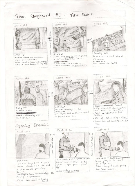
Group Planning Taken Storyboard

Below are the story boards which were created by Seb Hall and is what we planned and used to shoot our footage for our film Taken.


Sunday 8 April 2012

Group Planning For Taken

Production Comany Name:   Unique Productions
Title of the Film:   Taken            Certificate: 18
Plot:
A teenager who has lost a loved one turns to alcohol due to effects of depression, whilst visiting the grave of his loved one the teenager is attacked and abducted into the an abandoned room where the doctor tortures his victims.

Group Roles:
Production Team
Written By - David Maddy & Philip Gatward
Directed By - Seb Hall
Filmed By - Seb Hall
Edited By - Dalian White

Screen Play
Victim: - Dalian White
Doctor: - Philip Gatward
Attacker: - David Maddy
Setting:
1.       Apartment
2.       Graveyard
3.       Alley
4.       Abandoned Room

Props Used:
1.       White Apron
2.       String
3.       Tape
4.       Medical Equipment (Needles, Scissors, Rubber Gloves)
5.       Fake Blood
6.       Chair
7.       Drink (Vodka Bottle)
8.      Bat
9.       Briefcase
10.   Weapon (Gun)
Editorial Script:
Production Company Name (Unique) lasts 2 seconds. Then fades into the films title (Taken) which moves across the screen then flashes all in time with the music.


Music Continues- Title screen fades into the opening. Close up of the alcohol on the table. First name appears on screen in a Bradley Hand ITC font (Written by Philip Gatward). Pours drink as the second name appears (Written by David Maddy).


Whilst pouring the drink the third name appears (Filmed and Directed by Seb Hall). Fourth name fades in (Edited by Dalian White). Same camera shot (Close Up).


Fades into the next shot. Panning shot of grave yard stops at Dalian (looking at a grave). When we see Dalian standing the next name fades in (Starring Dalian White).


Fades into a long shot of Dalian walking down the alley beside the graveyard. Next name appears (Starring David Maddy). Walks away With Prop 7.


David enters the same shot, follows Dalian, Carries Prop 8.


Camera changes to a mid shot of Dalian being followed. Camera changes to a point of view (p.o.v) shot from Dalian of David swinging the bat. Sound affect of the swinging and also the bat hitting.

Cuts to a black screen.

Fades into next shot. Point of view (p.o.v) shot from Dalian of him waking up. Camera wobbles, and is blurry.
Dalian makes groaning sounds.

Sound affect added of a radio turning on. Music begins (Sailors Windpipe).

Affects added to create double visions.

Cuts to a shot of Dalian awaking taped up to prop 6 with props 2 & 3. Philip walking over to him (Wearing prop 1). Well lighted. tears prop 3 off Dalian’s face.

Close up of Dalian spitting prop 5 towards Philip (Wearing prop 1).

Camera fades into a shot of Philip slapping Dalian. (Still cant see his face). As he is slapped Dalian spits prop 5 over the wall.

(Music Still Playing)

Panning shot over the desk. looking at props 2, 3, 4 and 9.

Sound of draw opening.

Camera switches to a high angle shot to see what is in the draw.

Philip pulls out prop 10. (Head out of shot)

Camera switches back to a long shot of Dalian taped to the chair. Philip walks over with prop 10 in hand. (Head out of Shot)

Camera switches to a close up of prop 10 being pointed at Dalian’s head.

Blood on the wall (In Shot). Blood visible on Dalian's head.

Camera cuts to a shot of the desk top and Philip putting the gloves on (Head out of shot)

(Music Still Playing)

Camera cuts to a close up of Philip using prop 4.

Camera then cuts to a mid shot of Philips back. (Cant see his face). Laughter included so he seems to be enjoying it. Dalian is out of shot so that we can not see what's happening to him.

Laughter fades out with the camera shot.

Saturday 7 April 2012

Indepentdent Film Research 3-3: The Wrestler (2008)


Writer: Robert D.Siegel Director: Darren Aronofsky

Plot:
A faded professional wrestler must retire, but finds his quest for a new life outside the ring a dispiriting struggle.


Cast:
Mickey Rourke – Randy ‘The Ram’ Robinson
Marisa Tomei – Cassidy
Evan Rachel Wood – Stephanie
Mark Margolis – Lenny
Todd Barry – Wayne

0:00 - 2:27 – Title scene


2:28- Camera: Mid Shot. Character: Randy. Props: Water bottle, Chair. Setting: Class room. Mise-en scene: Football table, Books, Clothing, Pictures, Chalk board, Toys. Costumes: Wrestling Costume. Non-diagetic sound: Door opening/closing.


2:45Camera: Mid Shot. Character: Randy, Extra. Props: Money, Water bottle, Chair. Setting: Class room. Mise-en scene: Football table, Books, Clothing, Pictures, Chalk board, Toys. Costumes: Wrestling Costume, Casual.


3:13Camera: Trailing. Character: Randy, Extras (Distance). Props: Suitcase. Mise-en scene: Posters/displays, Wrestling ring. Costume: Casual. Non-diagetic sound: Dissembling wrestling ring.


3:26Camera: Mid Shot. Character: Randy, Extra. Props: Poster, Pen. Mise-en scene: Basket ball hoop, wrestling ring, fence. Costume: Casual. Setting: Sports hall. Non-diagetic sound: Dissembling wrestling ring.


4:05Camera: Over shoulder. Character: Randy. Props: Van. Mise-en scene: Shops, Traffic. Costume: Casual. Setting: High street. Non-diagetic sound: Radio.


4:19Camera: Trailing. Character: Randy. Prop: Keys. Mise-en scene: Chair (garden furniture), Trailer/mobile home. Costume: Casual. Setting: Trailer/mobile home park. Non-diagetic sound: Barking dog.


5:25Camera: Mid shot. Character: Randy. Prop: Door. Mise-en scene: Sign ‘Managers Office’. Costume: Casual. Setting: Trailer/mobile home park (managers office).